Every decade has its design trends and faux pas. In the 70s, for example, shag carpet was groovy and stylish. But now, we know how much dirt and bacteria accumulated in those deep fibers.

Colors can be fads, too. At the end of each era, people seem to come to their senses and get rid of certain trendy colors. Believe it or not, those ugly yellow counters in your grandma’s kitchen used to be considered cool.
We understand that just because something is currently trending doesn’t mean it will be popular for long. And that knowledge makes some of us hesitant to decorate.
But in 2020, fashion mavens have a pretty good idea of what is classic and what’s cliche and gaudy.
As long as you avoid these seven color mistakes in your apartment, you’re golden:
-
Table of Contents
Not Everything Must Match
There’s a fine line between coordinating colors and taking your color scheme too far. Too much of one color can be overwhelming.
Instead of decorating with different shades of one color, use a color wheel to find some complementary colors to go with your dominant hue. Find accent decorations in those colors and incorporate them into your design.
If you’re focusing on patterns instead of colors, the same rule applies. Just because your kitchen floor has a checkerboard pattern doesn’t mean your entire house has to!
And here’s a message for the collectors out there:
Please, please don’t coordinate your entire house with your collection.
It’s okay to display your collection of figurines or animal knick-knacks, but you should know when to stop. You don’t have to color-code everything in your room to match your ceramic cow collection!
2. Each Room Doesn’t Need Its Own Theme
With so many home makeover shows on TV, it has become a common myth that every room needs a separate theme. This idea doesn’t hold water in the average house.
Instead, your rooms should have subtle themes that seamlessly transition from one to the next.
For example:
If your living room shares an adjoining wall with the kitchen, they should share a similar theme. They don’t have to be identical (and they probably shouldn’t), but they should feel like they’re in the same house.
For instance, you might opt for a relaxed, beachy atmosphere in your living room and bright, fun colors in the kitchen. That’s good. The theme will read as “seaside living” without being too overbearing.
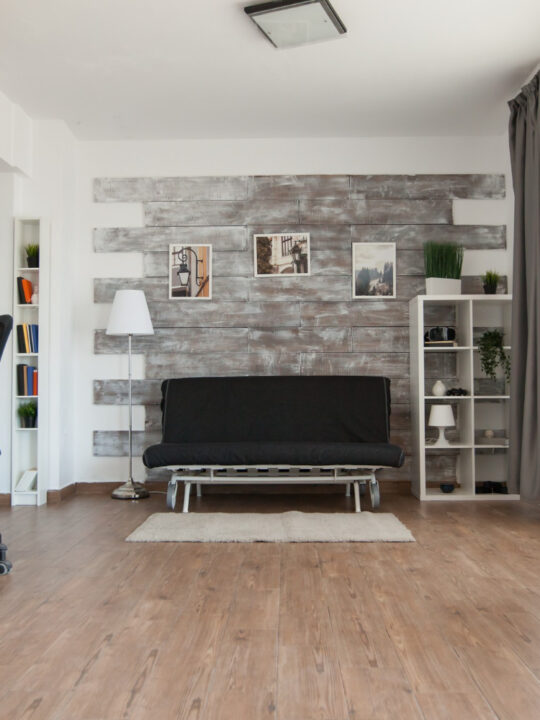
3. Don’t Use Dark-Colored Wall Decor
Your favorite color may be black or navy blue, but those aren’t good colors for wall decor.
Dark colors make a room feel smaller and less welcoming. If your wall decorations are moody and gloomy, then guests won’t feel very comfortable in your space.
Even if your walls are neutral, your decor should not be predominantly dark. Instead, choose a brighter shade of the color you prefer. It’s okay to have purple or even gray decorations, but keep them on the lighter side of the color spectrum.
4. Trending Colors May Not Be a Good Investment
Whenever you spend money on home decor, it should last you at least a few years.
If you go too wild on a trendy color, you might change your mind about it within a few months.
So, be careful about buying all of your bathroom accessories in bubblegum pink just because it’s popular. Before long, you might find that color nauseating!
5. Avoid Extremism
Anything that is “too much” is, well … too much. When it comes to interior design, try not to go overboard with anything, especially color.
Minimalism is one common form of design extremism.
In simple terms, being a minimalist means avoiding clutter and living with the bare necessities. This is a good idea, in theory.
But at its worst, minimalism crosses the line into sparseness. Extreme minimalists often paint their homes in plain, unshaded white and get rid of all their decorations. The overall effect is cold and unwelcoming.
Too much color is also a bad extreme. Variety is great, but not when it comes to your room’s color scheme.
An overabundance of color can cause stress on the brain. Overly bright colors or extreme contrasts can literally cause headaches.
The good news is that there’s a happy medium. Pick two to three shades and stick with them throughout your room. This will feel bold without being cluttered and disorganized.
6. Don’t Overdo the Bling Thing
Jeweled tones have been popular since the beginning of the millennium. But too much bling is definitely a bad thing.
Sequins, glitter, and other shiny accents can be fun. And a lot of bling is acceptable if you’re a child. As an adult, though, it’s time to tone it down with shiny objects in your apartment.
There’s a time and place for bling, so you don’t have to get rid of all of your sparkles. Just use them in moderation. Bling should be an accent to your color scheme, not the scheme itself.
7. Use Metal with Caution
It’s hard to avoid metals in your decor scheme. After all, most appliances include some kind of visible metal. But if you intentionally add metal to your decor, be careful.
Some metals tend to rust and fade quickly. If they are made of iron, it won’t take long for them to chip and turn orange.
Metals such as stainless steel, galvanized steel, copper, bronze, or brass are better options. These materials are often used in appliances because they are corrosion-resistant.
Chrome is another popular metal found in apartment decor. Use small pops of this metallic color to add sophistication and style to your room.
Conclusion
Your apartment should showcase your personality and interests. And it should do so without making any of these common color mistakes.
Remember:
Less can be too minimal, and more can be too much. Use these tips to find a happy medium and make your apartment feel like home!
Author bio:
Caitlin Sinclair is the Property Manager at Summit at San Marcos. She has a passion for her community and loves making Summit at San Marcos a great place to call home.